Many people use their phone dozens of times a day, yet the home screen often ends up arranged by accident rather than by purpose. New apps land wherever the phone places them, old folders stay from months ago, and useful tools get buried behind icons that are rarely opened. The result is not always dramatic, but it slowly makes the phone feel more crowded and less helpful than it needs to be.
That is why it helps to organize your phone home screen with intention. A better home screen is not about making the phone look perfect. It is about making the first screen match everyday life. When the apps you truly use are easier to see and reach, the whole device feels quicker, calmer, and less full of small unnecessary decisions.
Why Home Screen Clutter Feels More Tiring Than It Looks
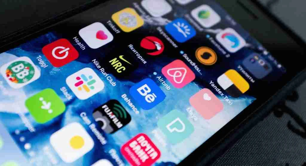
A messy home screen does more than take up visual space. It also makes the brain scan harder every time the phone is unlocked. The user is not only looking for one app. They are sorting through colors, folders, badges, widgets, and leftover icons that may no longer matter. Even if that scan takes only a second or two, repeating it all day can make the device feel more mentally busy.
Mobile usability researchers explain that visual clutter affects speed and attention together. The more crowded the first screen becomes, the less helpful it is as a starting point. The user stops feeling guided and starts feeling surrounded by options, many of which are not relevant in that moment. Experts recommend treating the home screen like an entry space, not like a storage drawer. The first screen should help the user begin, not force them to sort through everything the phone contains.
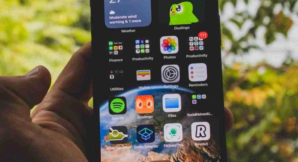
Start With the Apps You Open Without Thinking
The easiest way to build a useful layout is to begin with the apps that already belong to muscle memory. These are the tools opened almost automatically: messages, phone, maps, camera, calendar, notes, browser, music, or whichever few apps shape the user’s actual routine. Smartphone setup specialists explain that these apps deserve priority because they reflect behavior rather than aspiration.
Many users place apps on the first screen based on what seems important in theory, not what they really touch every day. That disconnect often leads to a home screen that looks organized but still feels inconvenient. Experts suggest watching daily behavior for a few days before rearranging. The apps reached most often are usually the ones that deserve the easiest physical positions.
Why the First Screen Should Be Smaller Than Most People Expect
One common mistake is trying to fit too much onto the first page. A screen full of icons may seem efficient because everything is visible, but it often becomes harder to read quickly. A smaller set of true essentials usually works better than a larger set of “probably useful” apps. Design researchers explain that restraint improves recognition.
When the first screen holds only the handful of apps most tied to daily action, the user can find them faster and with less thought. The phone begins to feel more direct because the first page has a job instead of trying to represent the whole device. Experts often recommend letting the first screen stay lighter than the others. It is the landing space, not the full catalog.
Group by Situation, Not by App Store Category
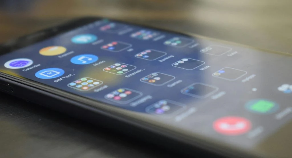
Folders can help, but they work best when they reflect real-life use instead of vague app labels. A folder called “Travel Day” or “Work Tools” is often more useful than one called “Utilities” or “Productivity” if the second label is too broad to mean much in the moment. Digital organization specialists explain that folders become easier to use when they match situations. For example, a commuting folder may include maps, transit, rides, and music.
A home management folder may hold grocery, calendar, notes, and delivery apps. A content folder may group reading, podcasts, and saved media. These types of groupings often reduce hesitation more effectively than generic categories. Experts recommend naming folders in a way that answers the question, “When do I use these?” rather than, “What technical type of app are these?”

The Bottom Row Should Earn Its Space
The dock or bottom row is often the most valuable part of the layout because it stays visible across screens on many phones. That space should usually be reserved for the few apps that feel truly foundational rather than simply popular. Phone, messages, camera, browser, or maps often belong there because they support quick action throughout the day.
Interface experts explain that users sometimes waste this space on apps they like rather than apps they constantly need. A shopping app, casual game, or occasional service may still be useful, but the dock works best when it reduces repeat effort for high-frequency actions. Experts suggest reviewing the bottom row with one question: which apps would be most annoying to hunt for several times a day?
Use Widgets Only If They Reduce Steps
Widgets can be helpful, but they also take up visual and physical space. A widget deserves a place only when it removes effort or shows information the user truly benefits from seeing without opening the app. Weather, calendar, reminders, or a focused note widget can work well for some people. Too many widgets, however, can make the home screen feel just as busy as scattered icons do.
Phone design analysts explain that widgets often become decorative habits rather than useful tools. If the widget does not support a regular action or meaningful glanceable information, it may be adding more distraction than convenience. Experts recommend using widgets sparingly and asking whether each one saves time often enough to justify the space it takes.
Why Hiding Rarely Used Apps Helps More Than Deleting Everything
Not every low-use app needs to be deleted. Some tools are perfectly reasonable to keep without giving them home screen space. Banking apps, airline apps, document scanners, event tools, and other occasional services may still matter, but they do not need to compete visually with the apps used every day.
App behavior researchers explain that users often think organization requires drastic removal. In reality, better placement is often enough. Moving less-used apps off the first screen, into folders, or into the broader app library can make the phone feel better immediately without changing what remains installed. Experts say this is one of the easiest wins in home screen cleanup. Less-used does not have to mean deleted. It simply should not dominate the main view.
Arrange Around Thumb Reach, Not Just Appearance
On larger phones especially, physical reach matters. Apps used constantly with one hand may be easier to place where the thumb naturally lands rather than where the layout looks balanced. A beautiful arrangement that feels awkward in real use often does not last long.
Mobile ergonomics researchers explain that small physical friction adds up quickly. If the user has to shift grip every time they open camera, messages, or notes, the layout may not truly fit the device or the habit pattern. Convenience often comes from comfort more than symmetry.
Experts recommend building the layout around real movement. The best home screen is the one that feels easy in the hand, not only tidy to the eye.
Why a Good Home Screen Evolves With Life Changes
A phone setup that worked during one season of life may not fit the next one. School apps rise during one period, travel tools matter in another, work apps become more important during busy projects, and family coordination tools may become central during certain routines. A good home screen is not fixed forever. It changes as daily life changes.
Productivity educators explain that people sometimes keep old layouts long after the routine that created them has ended. That is how clutter returns. The first page becomes filled with apps tied to an older version of life instead of the present one. Experts recommend doing a quick review every few weeks or after a major routine shift. If the home screen no longer reflects daily habits, it is time to rearrange again.
What a Well-Organized Home Screen Should Feel Like
A useful layout usually feels quieter, faster, and more obvious. The most needed apps are visible. The folders make sense immediately. The first screen stops trying to display everything. The phone becomes easier to unlock with purpose instead of opening into a wall of equal choices. Digital wellbeing specialists explain that this feeling matters because phones are used constantly.
Even a small reduction in visual friction can change how smooth the device feels across the whole day. The effect is not dramatic in one moment, but it becomes noticeable through repetition. Experts say the best reason to organize your phone home screen is simple: the apps you actually need should be easier to reach than the ones you only downloaded once and forgot.
Frequently Asked Questions
Q: What is the best way to organize a phone home screen?
A: A strong setup usually starts with the apps used most often, keeps the first screen lighter, and groups the rest by real-life routine.
Q: Should every installed app appear on the home screen?
A: No. Many apps can stay installed without taking up first-screen space if they are only used occasionally.
Q: Are folders useful on a phone home screen?
A: Yes, especially when they are organized by real situations like travel, work, home, or content rather than vague labels.
Q: Do widgets always improve a layout?
A: Not always. Widgets help most when they reduce steps or show meaningful information without adding too much clutter.
Q: How often should a home screen be reorganized?
A: A quick review every few weeks, or after a routine change, often keeps the layout more aligned with daily life.
Key Takeaway
To organize your phone home screen is to make the device reflect real daily habits instead of random app accumulation. Experts recommend keeping the first screen focused, grouping apps by routine, reserving the easiest positions for the most-used tools, and hiding less-used apps from the main view. A better home screen does not show everything. It shows what matters first.