Many users want to organize your phone home screen because a crowded layout can make simple tasks feel slower than they should. Apps spread across several pages, old folders stay in place, and rarely used icons compete with the tools people actually open every day. Over time, that clutter can turn a helpful device into something that feels more visually noisy and harder to use quickly.
Mobile device specialists explain that a better home screen is not only about appearance. It also affects how easily users reach daily tools, how often they get distracted, and how much effort it takes to move through the phone. Digital organization researchers also note that a simpler layout often reduces unnecessary app opening because the screen reflects real habits instead of older ones.
Why It Helps to Organize Your Phone Home Screen Around Real Use
Many people set up a phone once and then rarely rethink the layout again. New apps get added where there is space, older icons remain even when they are barely used, and the phone slowly turns into a collection of habits from several different stages of life. A better layout begins when users stop organizing by what was useful months ago and start organizing by what matters now.
Phone usability experts explain that home screens work best when they reflect repeated actions. If messaging, maps, camera, notes, calendar, and banking are used often, those tools should be easier to reach than apps opened once every few weeks. A good layout reduces friction because it puts the most useful apps closest to the thumb and the eye.
Experts recommend thinking about frequency first. A phone usually becomes easier to use when the layout follows real daily behavior instead of random app order.

How to Organize Your Phone Home Screen by Clearing Obvious Clutter First
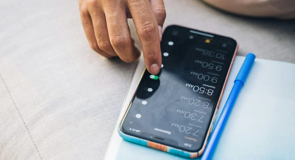
One of the easiest ways to organize your phone home screen is to remove the most obvious clutter before making deeper layout decisions. This usually includes duplicate apps, old folders, apps never opened, shortcuts that no longer matter, and widgets that take space without offering daily value.
Device support professionals recommend starting with a quick first pass instead of trying to design the perfect screen immediately. Remove what is clearly unnecessary first. Once those items are gone, the layout becomes easier to evaluate. Users can then see which apps really compete for space and which ones deserve the most visible positions.
Experts suggest being honest about what no longer needs home screen space. An app can stay installed without staying visible on the first page.
Why the First Home Screen Page Matters Most
The first page is often the most important because it is the part of the phone users see most often. That page should usually hold the apps needed for the day’s most repeated actions. If the first page is crowded with occasional-use tools, the phone becomes harder to navigate every time it is unlocked.
Smartphone organization specialists explain that the first page works best as a quick-access zone. Messaging, phone, camera, notes, maps, calendar, and one or two other essential tools often belong there more naturally than shopping, travel, or entertainment apps. This does not mean all leisure apps must disappear. It means the first page should support daily function before everything else.
Experts recommend treating the first page as prime space. Only the most useful apps should stay there permanently.
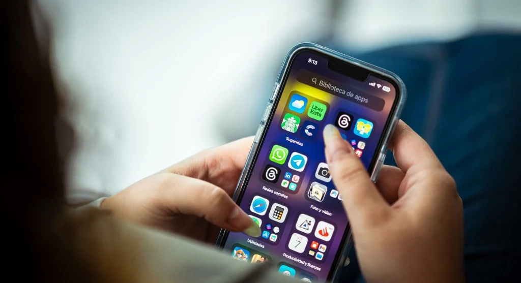
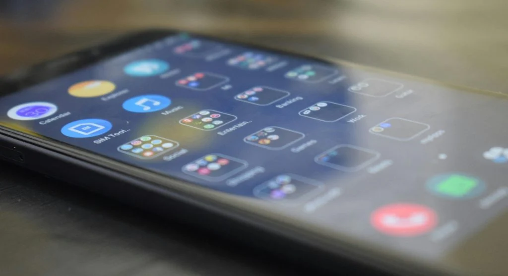
How App Folders Can Reduce Home Screen Clutter
Folders are one of the simplest ways to reduce home screen clutter, but they work best when they stay clear and limited. A folder can help group related apps such as finance, travel, editing, shopping, or utilities. The problem starts when folders become too large or too vague, because then users still have to search through them every time.
Digital workflow researchers explain that smaller folders with meaningful names usually work better than giant catch-all folders. A folder called “Travel” is more useful than one called “Other.” A folder with four shopping apps is easier to use than one with fifteen unrelated icons mixed together. Good folder design reduces clutter without hiding everything behind another layer of confusion.
Experts recommend creating folders only where they remove friction. If a folder adds extra steps to reach an app opened constantly, that app may belong outside the folder instead.
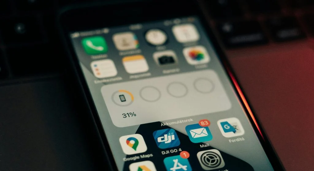
Why Widgets Should Be Chosen Carefully
Widgets can be helpful, but they also take up valuable space quickly. A weather widget, calendar view, to-do list, or battery panel may save time if it is actually checked often. At the same time, too many widgets can make the home screen look busy again and reduce room for the apps users need to tap directly.
Phone design analysts explain that widgets work best when they support information users truly want at a glance. If a widget is rarely read or duplicates information already easy to find elsewhere, it may be adding visual clutter without offering much practical value. This is especially true on smaller screens where every block of space matters more.
Experts recommend keeping only the widgets that answer a repeated question quickly, such as weather, schedule, or task reminders. Everything else should earn its place clearly.
How App Placement Can Match One-Handed Use Better
Phone organization feels better when it matches how the device is actually held. Many users unlock and navigate with one hand, which means the easiest-to-reach parts of the screen matter more than the top corners. Apps opened often should usually sit where the thumb can reach them quickly without extra stretching.
Usability specialists explain that this matters especially on larger phones. A perfect-looking grid may still feel awkward if the most important apps are placed too high or too far away from normal reach. Small placement changes can make repeated actions feel faster even when the app list itself stays almost the same.
Experts recommend arranging the most-used apps for comfort, not only for visual symmetry. A phone is a tool first, not only a display.
Why Fewer Pages Often Make the Phone Feel Simpler
Some phones spread apps across four, five, or even more pages without any real structure. That makes the home screen feel larger, but not necessarily better. Each extra page adds another place where users may lose track of what they are trying to open. In many cases, fewer pages with clearer grouping feel much easier to use.
Productivity researchers explain that reducing page count often lowers decision fatigue. Instead of swiping repeatedly, users can usually keep one main page, one secondary page, and a few folders for less frequent tools. This creates a smaller mental map of the phone, which makes navigation feel faster and calmer.
Experts recommend asking whether an extra page is truly useful or whether it only exists because older app icons were never reorganized properly.
How Small Reviews Keep the Home Screen Useful Over Time
A home screen does not stay organized forever on its own. New apps arrive, habits change, and old shortcuts remain longer than they should. That is why small reviews help more than rare total redesigns. A short cleanup every few weeks can remove unused icons, adjust folders, and keep the main page aligned with current routines.
Mobile organization educators recommend linking this review to other small digital habits, such as clearing notifications, checking storage, or reviewing recent downloads. A short refresh usually takes only a few minutes when done regularly and prevents the layout from becoming crowded again.
Experts say the best way to organize your phone home screen is to keep it focused on what supports daily life now. A calmer screen often leads to calmer phone use because the device stops asking for attention from every direction at once.
Frequently Asked Questions
Q: What apps should stay on the first home screen page?
A: Experts usually recommend keeping the apps used most often, such as messaging, phone, camera, maps, notes, and calendar tools.
Q: Do folders really help reduce home screen clutter?
A: Yes. Small folders with clear names can reduce clutter, though overly large or vague folders often create new confusion.
Q: Should every app be visible on the home screen?
A: No. Many apps can stay installed without using main screen space if they are only opened occasionally.
Q: Are widgets always useful?
A: Not always. Widgets help most when they provide information users actually check often, such as weather or calendar details.
Q: How often should a home screen be reviewed?
A: A short review every few weeks is often enough to keep the layout easier to use and less cluttered.
Key Takeaway
Learning how to organize your phone home screen can make everyday phone use feel faster, calmer, and easier to manage. Experts recommend clearing obvious clutter first, giving the first page only to high-value apps, using small folders carefully, and keeping widgets only when they offer real daily value. A better phone layout works best when it reflects real habits instead of old app choices that no longer matter.